Slicer3:UIDesign:WorkingProblems:WelcomeModule:Draft
From Slicer Wiki
Home < Slicer3:UIDesign:WorkingProblems:WelcomeModule:Draft
Return to Slicer Welcome Module UI Design
Contents
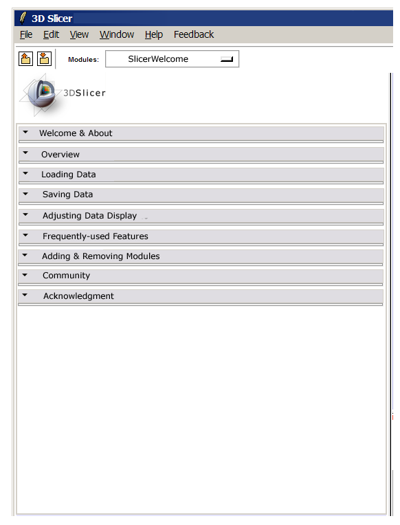
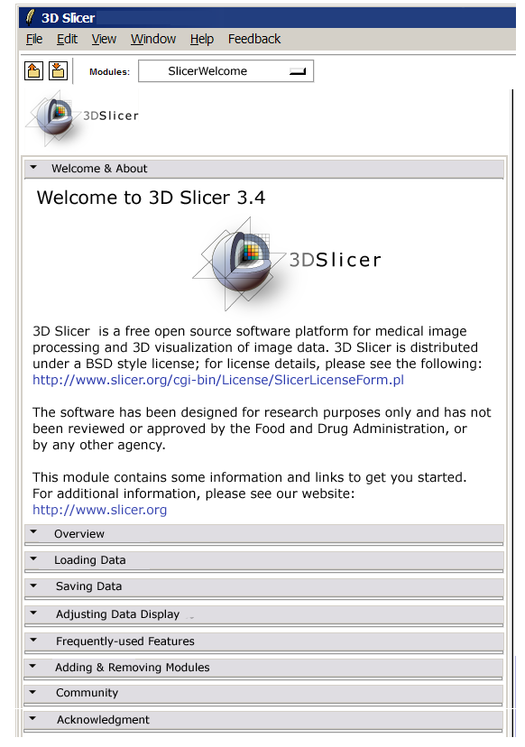
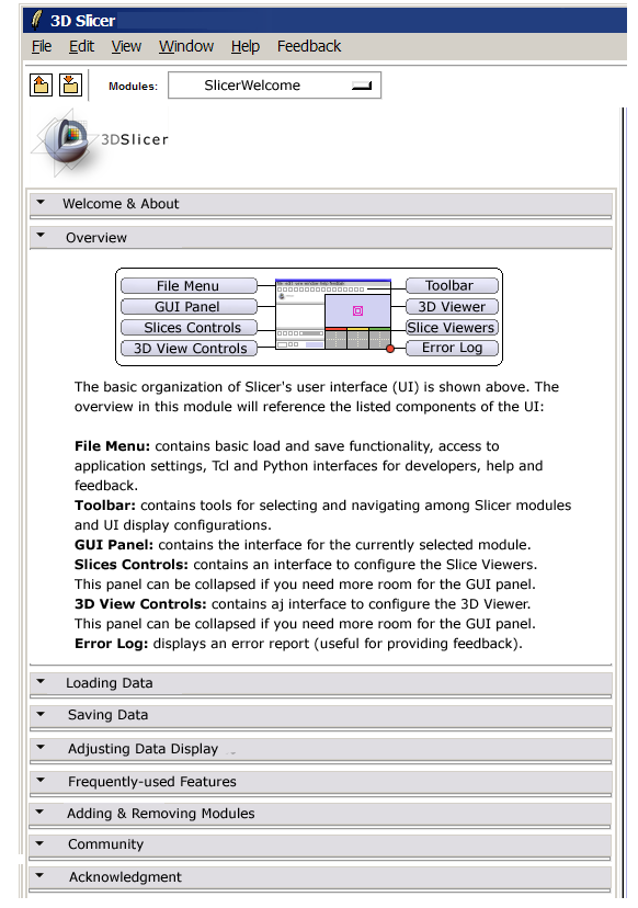
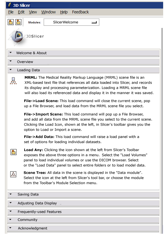
Welcome Module GUI panel sketches
Welcome Module Content
- Suggest changing "Frequently-used features" to "Common activities: hints & pointers"
About Page
- Ron recommends designing this so that the disclaimer material is present but deemphasized.
Overview
- The user interface drawing looks great. Maybe changing the color of the red dot as it puts a lot of emphasis on the words 'Error log' ?
- There is a minor typo in the 3DView Controls text ('contains an interface to configure')
Loading
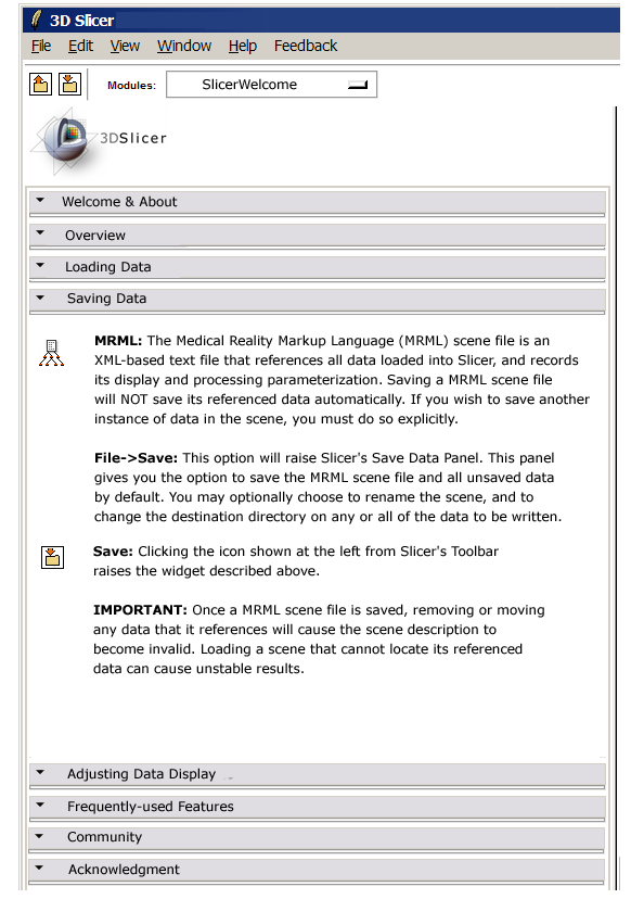
Saving
In the first sentence of the 'Important' paragraph, maybe specifying 'adding removing or moving on disk' and '(...) locate its referenced data on disk'?
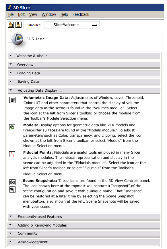
Display
In the last sentence of the paragraph 'Scene Snapshots': maybe add 'Scene Snapshots will be saved when you save your scene' (so that users know they still need to save the scene. )
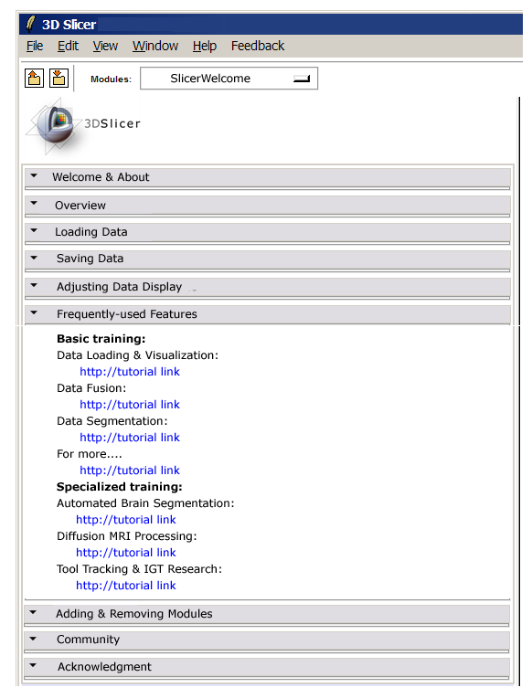
Frequently used features
- Ron's suggestion: make a little bit more descriptive. Like:
- Information and tutorials on data fusion (merging multiple datasets for a single subject): links
- Training about basic data loading and adjusting its visual display: links
...
- Changing Basic training to Core training as image registration techniques may not be familiar to all audiences ?
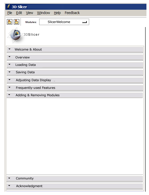
Adding and Removing Modules
Find out from Steve what info should go here...
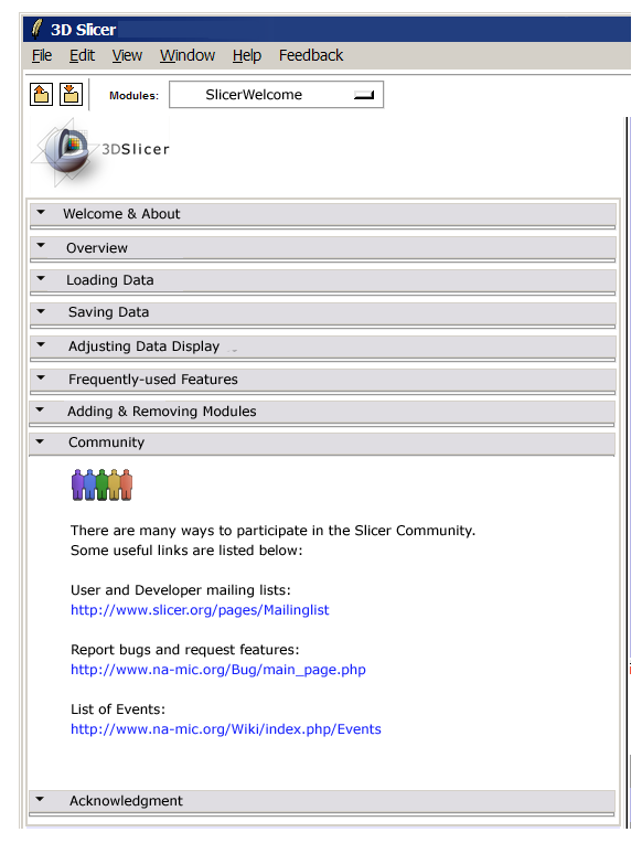
Slicer Community
- How about replacing List of Events by 'Join a Workshop or a Programming Week event'?
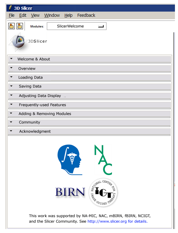
Acknowledgement
- Ron recommends using the na-mic logo without the line.
- In the last sentence, maybe the words 'for details' do not need to appear as a web link ?
