Slicer3:UIDesign:WorkingProblems:SlicerUsabilityInTractography:PreRegistration
Back to Slicer3 UI design
Back to Tractography project
Contents
2 Quality Check
This step includes looking at all datasets, setting window, level, threshold, removing the background (maybe skull stripping?) and comparing two image data sets (same or different patients) to assess how they are registered. Two biggest comments here are ease of use and reliability.
Data Browsing
![]() Important to have some obvious browserie where user can click on a list of loaded data and SEE the dataset.
Important to have some obvious browserie where user can click on a list of loaded data and SEE the dataset.
![]() Not intuitive to have to manipulate a Slice Viewer's UI in order to browse thru loaded datasets.
Not intuitive to have to manipulate a Slice Viewer's UI in order to browse thru loaded datasets.
![]() Difficult to understand the main overview in the data panel.
Difficult to understand the main overview in the data panel.
- Again, what is a MRML scene?
- What are the long node names? (fixes checked into svn to toggle display of node name, with default OFF)
- The meaning of 'camera' and 'view' are not obvious to novice users
- Would be good to know whether a dataset is saved or not in this main browser.
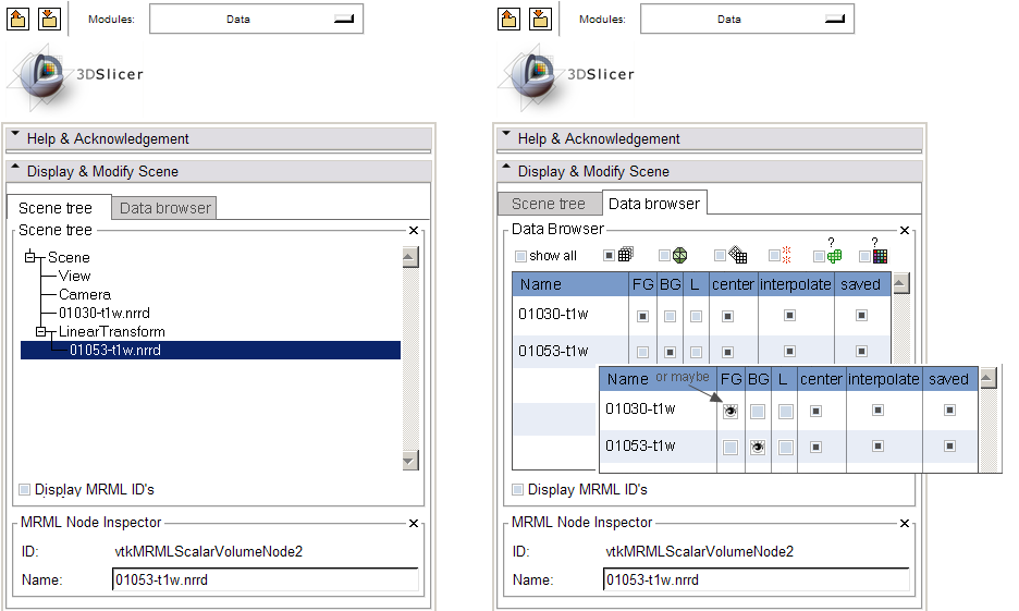
![]() Suggestion is to provide multiple ways to view scene and data (see sketch below for a start):
Suggestion is to provide multiple ways to view scene and data (see sketch below for a start):
In the above sketch:
- tabbed views of the scene & data
- data browser allows quick listing of all loaded data OR subsets of data according to type:
- image data (volumes)
- geometry data
- fiducials (may require different table setup)
- (?) in future possibly: object-based ROIs (would require a different table setup)
- (?) in future possibly: color maps (would require a different kind of display)
(this reinforces the taxonomy of data types available in Slicer)
Suggestion was to let user double-click on a dataset name to show it in the FG in all viewers.
In example shown, an easy way to integrate with existing logic lets you select visibility in any layer. Could still let you double-click on name to display in the FG.
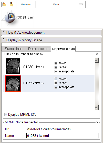
![]() Suggestion was that thumbnail browser might be good as well... get feedback on something like this:
Suggestion was that thumbnail browser might be good as well... get feedback on something like this:
Window/Level/Threshold
![]() 3D view doesn't always update when W/L/Thr are adjusted (sometimes you have to twiddle the view). In particular,
3D view doesn't always update when W/L/Thr are adjusted (sometimes you have to twiddle the view). In particular, ![]() JJ's comments that he's having trouble reliably setting window and level in auto/manual modes: "...I guess that there is mistake with the update between values_display_buttons (auto/manual)."
JJ's comments that he's having trouble reliably setting window and level in auto/manual modes: "...I guess that there is mistake with the update between values_display_buttons (auto/manual)."
![]() On Histogram widget, there are lots of little handles that user can grab and move around -- not at all clear what they are, or what they do. At least put pop-up help here.
On Histogram widget, there are lots of little handles that user can grab and move around -- not at all clear what they are, or what they do. At least put pop-up help here.
![]() Request: to right click in Slice Viewers to adjust W/L/Thr (this is common paradigm in Med Img software).
Request: to right click in Slice Viewers to adjust W/L/Thr (this is common paradigm in Med Img software).
![]() Request: Would be useful to be able to change a Slice Viewer's background color. When thresholding, cannot distinguish Slice Viewer background and an interior region with dark/black pixel value.
Request: Would be useful to be able to change a Slice Viewer's background color. When thresholding, cannot distinguish Slice Viewer background and an interior region with dark/black pixel value.
![]() Can we see a 'volume rendered' image -- even a crude one -- to check a threshold setting? (shouldn't have to go to the Volume Rendering module to take advantage of this feature).
Can we see a 'volume rendered' image -- even a crude one -- to check a threshold setting? (shouldn't have to go to the Volume Rendering module to take advantage of this feature).
![]() Can we add a set of 'advanced' options, like:
Can we add a set of 'advanced' options, like:
- Remove background
- Strip skull
- other?
Fading between Layers
- Confusing that Label map overlay transparency/opacity slider is separate and different from the FG/BG fade slider.
- Short term: good to have a FG/BG fade slider in *each* SliceControllerWidget, and not only one that adjusts all three viewers.
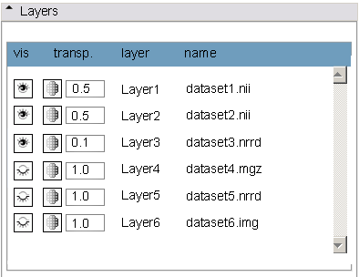
- Longer term: list of layers of arbitrary length, compositing rules, visibility and opacity selection per each.
- Concept (any layer in list overlays layers below).
- Drag and drop to change layer order?
4 Deformation
Currently users are doing the following:
- navigating to the volumes module's Information panel and adjusting the image spacing and origin to apply an implicit "distortion" of a dataset,
- resaving the adjusted volume.
Defaults in Resample Volume2 are (0,0,0) and it's not interactive.
Should discuss the correctness of this.


