Slicer3:UIDesign:WorkingProblems:SaveDataWidget:Draft1
From Slicer Wiki
Home < Slicer3:UIDesign:WorkingProblems:SaveDataWidget:Draft1
Back to SaveDataWidget Working Problem
Back to Slicer3 UI Design
Draft 1
- Save Data: how can one save a data file as a specific/different ITK file format. ITK uses a IO plugin framework to support new file formats: is there a way to find the list of file formats supported by ITK at run-time.
- I (Seb) to check with Luis
- [UPDATE] see ImageFileReader<...>::GenerateOutputInformation, BUT every IO file/reader need to expose the list of file extensions it can read and write. Luis is on it, to be added 3.8 end of July. Luis is fast, it's in the CVS, and examplified in itkImageIOFileNameExtensionsTests.cxx
- Save Data: the "Save" dialog in general is very confusing and buggy. The "Save All" and "Save None" button are mislabelled since they don't perform any save. Saving data to a new file format requires the user to double-click in the file name and manually change the file extension (provided that this extension is known to the user). Changing the data directory does not update the data locations in the multicolumn list (it does if you change the data directory twice). Changing the scene directory has no impact on the data directory.
- I (Seb) suggest that the "Save All/None" should be something like "Mark all for save", "Mark none for save". A button should be placed next to each data filename/location to quickly switch to a new file type (depending on what ITK can save to at run-time). The dialog is large, we have room to put a help string/label that explains a little more how the whole dialog works. Changing the data directory should update the location of each data entry in the multicolumn list correctly. A button should be added to quickly set the data directory to match the scene directory (it should not be automatic though).
- (wjp): How about something like one of the following designs (comments/revising welcome):
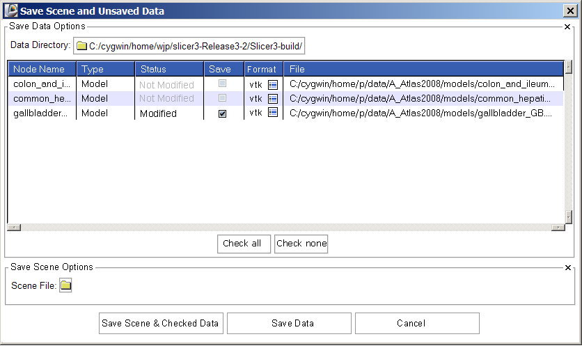
Draft1
The designs include the following adjustments:
- Save data options come first, scene options second
- Node type is the second column
- "Not modified" status is displayed in grey, so that "Modified" status stands out
- Format column is added, showing (optionally) the current format and an icon-button for switching (imagine clicking button, having pop-up widget for choosing among supported file formats. Once a format has been confirmed, the file name is changed to show the new file extension, and if required, "Not Modified" changes to "Modified". Should "save" also be automatically selected too? -- I think probably yes, but this may turn out to be annoying.
(SP) Yes, it would be useful to have 'Save' automatically selected after changing the file extension.
- buttons for "Check all" "Check none" are below multi-column
- Save scene checkbutton is gone -- instead user is given three options at the GUI bottom.
- Wonder if "Save Data" should be changed to "Save Data Only"?
(SP) Yes, that would make things clearer.
Icons are here, in case we want to use one of them...
Here's another stab at this widget after playing with it for awhile:
- Controls that set parameters for all datasets (check all, uncheck all, set data dir for all) are clustered together.
- User has two ways to change format easily -- using the format icon button and editing the filename.
- User has two ways to specify the save data directory (the button for all files, and individual buttons for individual datasets.)
Previously, the path name had to be hand edited, which is an error-prone exercise. The filename (and extension) were often trailing off the end of the window, so one had to click and scroll in the filename column in order to see the entire path or discover the dataset format. (Image has been updated to reflect review with Yumin and Wendy).

