Documentation/Nightly/Developers/Plots
|
For the latest Slicer documentation, visit the read-the-docs. |
Slicer plotting overview and acknowledgements
Slicer provides Plotting facilities that include a plot view that can be displayed in the view layout, similarly to slice 3D views. Plot data is stored in table nodes, and plot series, chart, and view nodes define which table column need to be displayed and how. Plot can be serialized with the MRML scene, including the plot data and display properties. Plot series and charts can be created and edited in Plots module and plots can be also generated directly from Tables module by a single click.
Authors:
Davide Punzo (Kapteyn Astronomical Institute, University of Groningen)
Andras Lasso (PerkLab, Queen's University)
Contributors:
Jean-Christophe Fillion-Robin (Kitware)
Steve Pieper (Isomics)
Acknowledgements:
This work was supported by the European Research Council under the European Union's Seventh Framework Programme (FP/2007-2013)/ERC Grant Agreement nr. 291-531.
![]()

Contacts:
- Davide Punzo, <email>punzodavide@hotmail.it</email>; <email>D.Punzo@astro.rug.nl</email>
Plot capabilities
- Multiple plots types (Line, Bar, Scatter, Scatter bar), shown in standard view layouts.
- Configurable chart and axis title, legend, grid lines.
- Use indexes (0, 1, 2, ...) or a table column for X axis values.
- Multiple plot series can be added to a single plot chart (even showing data from different tables, with different types - plot, bar), and the same series can be added to multiple charts. The same plot chart can be shown in any plot views (even simultaneously).
- Label can be assigned to each data point (shown in tooltip when hovering over a data point).
- Interactive editing of data points by drag-and-drop (data in referenced table nodes is updated).
- Interactive selection of data points (rectangular or free-hand selection).
- Plot data and display properties are stored in the MRML scene.
- Plot view can be embedded into module user interfaces. Plot views can emit signals back to the application as the user interacts with a plot, which allows modules to perform additional processing on the selected data points.
What is the difference between Slicer Plot and Chart? See FAQ.
Shortcuts and Interactions
The Plot infrastructure allow the following interaction:
- Left mouse button: depends on interaction mode of the view
- Pan view: pan view
- Select points: select points using rectangular selection
- Freehand select points: select points using free-form selection
- Move points: move data points by drag-and-drop; this changes values in the referenced table node
- Middle mouse button: pan view (except in pan view mode; in that case it zooms to selected rectangular region) - Right mouse button: zoom in/out along X and Y axes
- S: switch interaction mode (pan/select points/.../move points)
- R: reset view to show all data series
Architecture
MRML Nodes
- vtkMRMLTableNode
- Table node stores values that specify data point positions or bar heights in the plots.
- vtkMRMLPlotSeriesNode
- Defines a data series by referring to a table node and column name(s) for X and Y axes and labels.
- It also defines display properties, such as plot type, color, line style.
- Line and bar plots only require Y axis (points along X axis are equally spaced), scatter plots require two input data columns, for X and Y axes.
- vtkMRMLPlotChartNode
- Specifies which data series need to be shown in the chart.
- Also contains global display properties for the chart, such as titles and font style.
- vtkMRMLPlotViewNode
- Specifies which chart is to be displayed in the plot view and how the user can interact with it.
- There has to be exactly one plot view node for each plot view widget. This class can not be created or copied unless is connected with a plot view.
Widgets
- qMRMLPlotView
- Displays a plot. It can be embedded into a module user interface.
- qMRMLPlotWidget
- Displays a plot and in a popup window a plot view controller widget plot view controller widget.
- qMRMLPlotSeriesPropertiesWidget
- Display/edit properties of a plot series node.
- qMRMLPlotChartPropertiesWidget
- Display/edit properties of a plot series node.
- qMRMLPlotViewControllerWidget
- Display/edit properties of a plot view node.
Constructing a plot
Below is an example in python to construct and display a plot communicating completely at the level of MRML.
import slicer
import math

# Create table with x, cos, sin columns

tableNode = slicer.mrmlScene.AddNewNodeByClass("vtkMRMLTableNode")
table = tableNode.GetTable()

arrX = vtk.vtkFloatArray()
arrX.SetName("x")
table.AddColumn(arrX)

arrY1 = vtk.vtkFloatArray()
arrY1.SetName("cos")
table.AddColumn(arrY1)

arrY2 = vtk.vtkFloatArray()
arrY2.SetName("sin")
table.AddColumn(arrY2)

# Fill in the table with some example values

import math
numPoints = 69
inc = 7.5 / (numPoints - 1)
table.SetNumberOfRows(numPoints)
for i in range(numPoints):
  table.SetValue(i, 0, i * inc )
  table.SetValue(i, 1, math.cos(i * inc))
  table.SetValue(i, 2, math.sin(i * inc))

# Create two plot series nodes

plotSeriesNode1 = slicer.mrmlScene.AddNewNodeByClass("vtkMRMLPlotSeriesNode", "My first")
plotSeriesNode1.SetAndObserveTableNodeID(tableNode.GetID())
plotSeriesNode1.SetXColumnName("x")
plotSeriesNode1.SetYColumnName("cos")
plotSeriesNode1.SetLineStyle(slicer.vtkMRMLPlotSeriesNode.LineStyleNone)
plotSeriesNode1.SetMarkerStyle(slicer.vtkMRMLPlotSeriesNode.MarkerStyleSquare)
plotSeriesNode2.SetUniqueColor()

plotSeriesNode2 = slicer.mrmlScene.AddNewNodeByClass("vtkMRMLPlotSeriesNode", "My second")
plotSeriesNode2.SetAndObserveTableNodeID(tableNode.GetID())
plotSeriesNode2.SetXColumnName("x")
plotSeriesNode2.SetYColumnName("sin")
plotSeriesNode2.SetUniqueColor()

# Create plot chart node

plotChartNode = slicer.mrmlScene.AddNewNodeByClass("vtkMRMLPlotChartNode")
plotChartNode.AddAndObservePlotSeriesNodeID(plotSeriesNode1.GetID())
plotChartNode.AddAndObservePlotSeriesNodeID(plotSeriesNode2.GetID())
plotChartNode.SetTitle('A simple plot with 2 curves')
plotChartNode.SetXAxisTitle('Something in x')
plotChartNode.SetYAxisTitle('Something in y')

# Switch to a layout that contains a plot view to create a plot widget

layoutManager = slicer.app.layoutManager()
layoutWithPlot = slicer.modules.plots.logic().GetLayoutWithPlot(layoutManager.layout)
layoutManager.setLayout(layoutWithPlot)

# Select chart in plot view

plotWidget = layoutManager.plotWidget(0)
plotViewNode = plotWidget.mrmlPlotViewNode()
plotViewNode.SetPlotChartNodeID(plotChartNode.GetID())
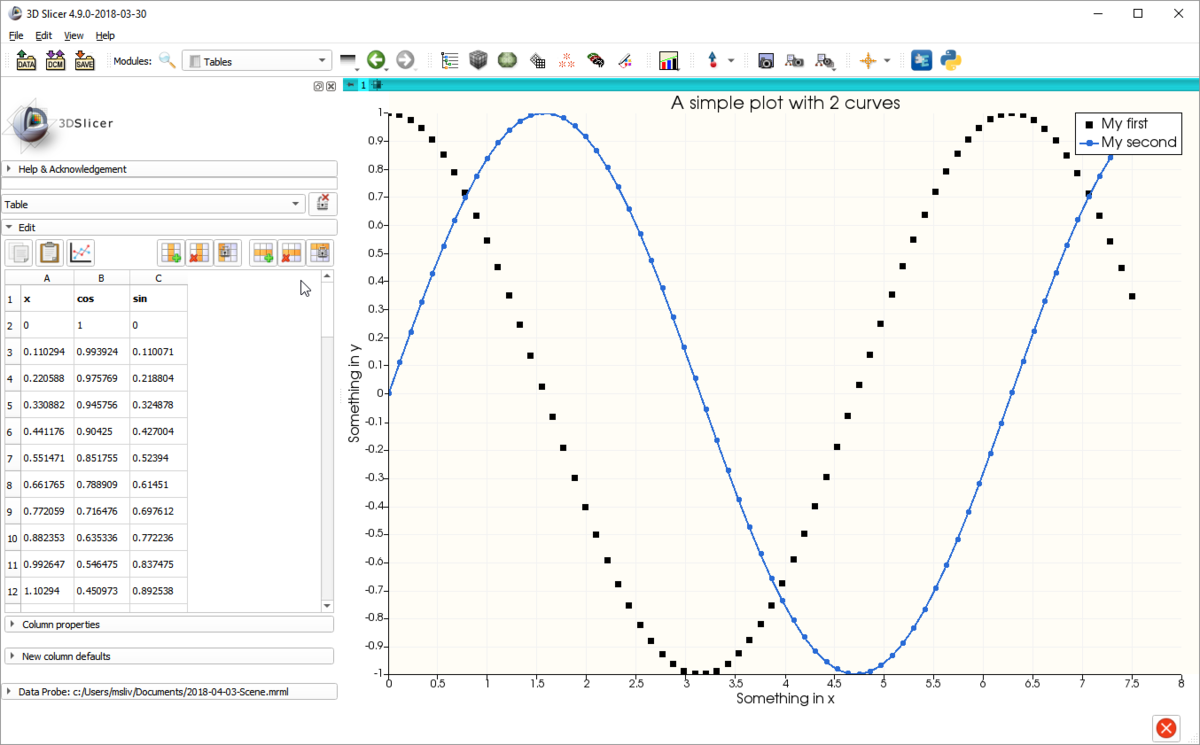
This code produces the plot below.
Signals
PlotViews provide signals that allow Slicer to respond to user interactions with the Plot canvas:
- void dataSelected(vtkStringArray* mrmlPlotDataIDs, vtkCollection* selectionCol)
- Signal emitted when a data point or more has been selected. Returns the MRMLPlotDataNodes IDs and the correspective arrays with the data points ids (vtkIdTypeArray).
Future Work
- Adding to VTKPlots the possibility to plot errorbars.
- Add categorical and date labels to the Bar plotting (analogous to the CHART infrastructure)
- More signals?
- Add 3D Plots (vtkChartXYZ)
- Add Click and Drag action for multiple selected points
