Difference between revisions of "User:Barre/TODO"
(→Draft5) |
(→Draft5) |
||
| (18 intermediate revisions by the same user not shown) | |||
| Line 99: | Line 99: | ||
====Draft5==== | ====Draft5==== | ||
| − | + | A user selects File->Save | |
| − | * | + | * widget raises with all modified data checked (as in current implementation). |
| − | * | + | User has four convenient select options: |
| − | * | + | * [[image:CheckAll.png]] Select scene and all data for saving |
| − | * | + | * [[image:UncheckAll.png]] Deselect scene and all data |
| + | * [[image:CheckModifiedData.png]] Select all modified data (not scene file) | ||
| + | * [[image:CheckModified.png ]] Select scene and all modified data. | ||
| − | ( | + | plus option to choose destination for all selected, and individual dataset options (as in current implementation). |
| − | + | * if user deselects ALL, then selects the a scene file, logic shouldn't automatically re-check all modified data. We don't do this now either -- currently if a user tries to save the scene and unchecked modified data exists, we just pop up a message telling the user that the save requires them to go back and check unchecked stuff. We can keep this same behavior and adapt the Save button logic a little: | |
| + | * When save is clicked, logic checks to see if scene saving is requested | ||
| + | ** if so, checks to see if all modified data is selected. | ||
| + | *** If yes, save. | ||
| + | *** If not, pop up the message. | ||
| − | '''Question:''' should a user be able to save a scene description that contains only the selected subset of data in a scene? I can imagine this to be useful: | + | Links to image data and resources: |
| + | * [[media:SaveDataWidget_Resources.zip | Link to image data resources ]] | ||
| + | * [[media:SaveDataWidget_Images.zip | Link to image data ]] | ||
| + | |||
| + | '''Question:''' Is it confusing to have the scene bundled in with the data? (wjp) I think that it's reasonable to ask users to understand the concepts of datasets and scene descriptions at a high level, and reasonable also to treat them collectively as writable data. Unless it's important to clarify their difference to the user, it's simpler and more compact to treat their saving consistently. Anything I'm missing -- other opinions? | ||
| + | |||
| + | [[image:SaveData7.png]] | ||
| + | |||
| + | |||
| + | '''Note: Might be nice feature to support someday:''' should a user be able to save a scene description that contains only the selected subset of data in a scene? I can imagine this to be useful: | ||
My scene contains a volume V, transform T and model M, and two other "working" volumes. I want to save those three nodes only and a scene description that includes them but NOT my working volumes -- but I don't want to delete them yet. | My scene contains a volume V, transform T and model M, and two other "working" volumes. I want to save those three nodes only and a scene description that includes them but NOT my working volumes -- but I don't want to delete them yet. | ||
| Line 117: | Line 132: | ||
** If the scene.mrml file exists, popup message says ''"You have chosen to overwrite the scene file without saving all modified data. MRML file will not describe this data. Ok to proceed? OK/Cancel'' | ** If the scene.mrml file exists, popup message says ''"You have chosen to overwrite the scene file without saving all modified data. MRML file will not describe this data. Ok to proceed? OK/Cancel'' | ||
** If the scene.mrml file doesn't exist, popup message says ''"You have chosen to save the scene file without saving all modified data in the scene. MRML file will not describe this data. OK to proceed? OK/Cancel'' | ** If the scene.mrml file doesn't exist, popup message says ''"You have chosen to save the scene file without saving all modified data in the scene. MRML file will not describe this data. OK to proceed? OK/Cancel'' | ||
| − | |||
| − | |||
| − | |||
| − | |||
===Other=== | ===Other=== | ||
Latest revision as of 12:27, 1 October 2008
Contents
Training Event in Germany
Notes from a session with Ron, important items to address to improve Slicer3 usability.
Save Data Widget
- Save Data: how can one save a data file as a specific/different ITK file format. ITK uses a IO plugin framework to support new file formats: is there a way to find the list of file formats supported by ITK at run-time.
- I (Seb) to check with Luis
- [UPDATE] see ImageFileReader<...>::GenerateOutputInformation, BUT every IO file/reader need to expose the list of file extensions it can read and write. Luis is on it, to be added 3.8 end of July. Luis is fast, it's in the CVS, and examplified in itkImageIOFileNameExtensionsTests.cxx
- Save Data: the "Save" dialog in general is very confusing and buggy. The "Save All" and "Save None" button are mislabelled since they don't perform any save. Saving data to a new file format requires the user to double-click in the file name and manually change the file extension (provided that this extension is known to the user). Changing the data directory does not update the data locations in the multicolumn list (it does if you change the data directory twice). Changing the scene directory has no impact on the data directory.
- I (Seb) suggest that the "Save All/None" should be something like "Mark all for save", "Mark none for save". A button should be placed next to each data filename/location to quickly switch to a new file type (depending on what ITK can save to at run-time). The dialog is large, we have room to put a help string/label that explains a little more how the whole dialog works. Changing the data directory should update the location of each data entry in the multicolumn list correctly. A button should be added to quickly set the data directory to match the scene directory (it should not be automatic though).
- (wjp): How about something like one of the following designs (comments/revising welcome):
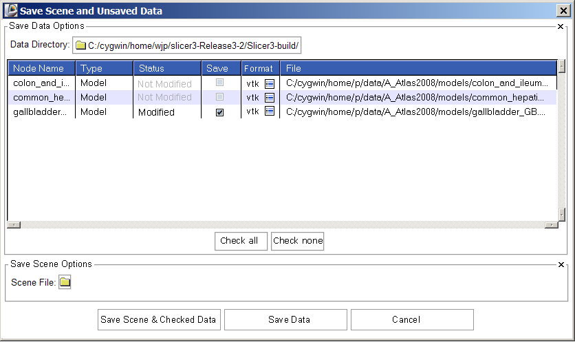
Draft1
The designs include the following adjustments:
- Save data options come first, scene options second
- Node type is the second column
- "Not modified" status is displayed in grey, so that "Modified" status stands out
- Format column is added, showing (optionally) the current format and an icon-button for switching (imagine clicking button, having pop-up widget for choosing among supported file formats. Once a format has been confirmed, the file name is changed to show the new file extension, and if required, "Not Modified" changes to "Modified". Should "save" also be automatically selected too? -- I think probably yes, but this may turn out to be annoying.
(SP) Yes, it would be useful to have 'Save' automatically selected after changing the file extension.
- buttons for "Check all" "Check none" are below multi-column
- Save scene checkbutton is gone -- instead user is given three options at the GUI bottom.
- Wonder if "Save Data" should be changed to "Save Data Only"?
(SP) Yes, that would make things clearer.
Icons are here, in case we want to use one of them...
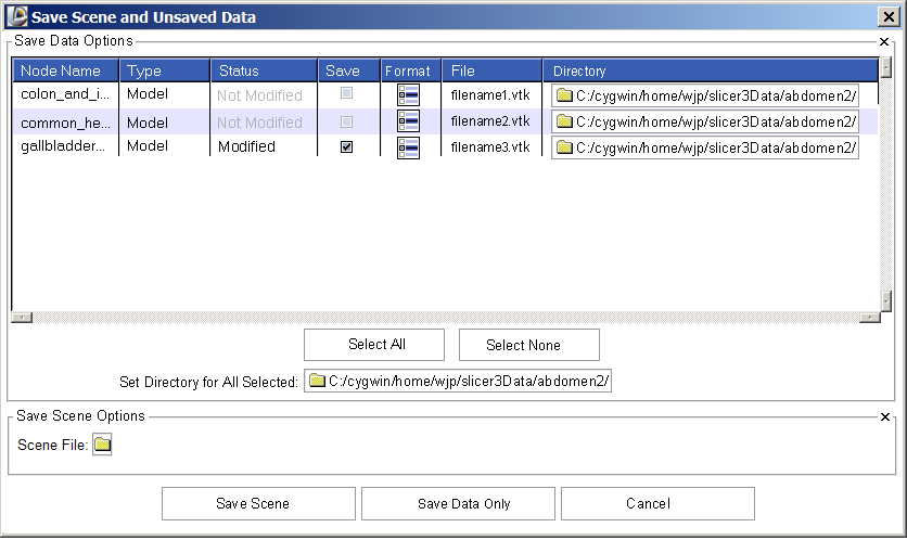
Here's another stab at this widget after playing with it for awhile:
- Controls that set parameters for all datasets (check all, uncheck all, set data dir for all) are clustered together.
- User has two ways to change format easily -- using the format icon button and editing the filename.
- User has two ways to specify the save data directory (the button for all files, and individual buttons for individual datasets.)
Previously, the path name had to be hand edited, which is an error-prone exercise. The filename (and extension) were often trailing off the end of the window, so one had to click and scroll in the filename column in order to see the entire path or discover the dataset format. (Image has been updated to reflect review with Yumin and Wendy).
Draft2
- [UPDATE] (Yumin)
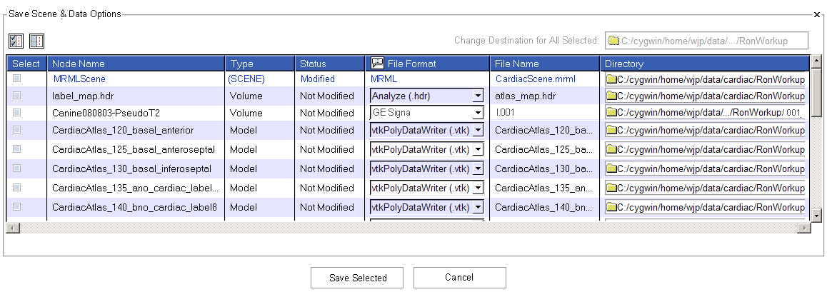
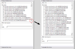
Here is an actual screen shot of the working-copy save dialog from my machine (it does not yet have the new design for options to save locally or remotely),
Implementation
It has the following changes:
- The "Select/Save" column is moved to be the first column.
- The "File Format" column is using a dropdown list, instead of using an icon to invoke another widget. The actual displayed texts for file formats in the dropdown lists are still being worked on as we are adding necessary APIs into itkImageIO.
Draft3
Below is a sketch for changes to the widget to expose functionality for saving to either local disk or remote repositories. This sketch is NOT ready to be acted upon -- just put here for discussion for now.
Draft4
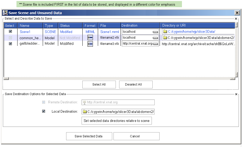
This new version (local data handling only) contains the following changes to current implementation:
- the word "Node" is dropped from column headings as much as possible since users don't need to think about "nodes"
- the Scene is listed along with data -- always at the top, and maybe in a different text color to highlight it.
- Changes to how File formats are handled for those without writing support are reflected (sketch included below widget mockups).
- "Select all" and "Select none" are above the multicolumn, over the Select column. Icons are used instead of text -- their balloon help should say "Select all" "Select none"
- The Data Directory File browse button is moved to top, above the Directory column.
- There's an icon-button included in the "Format" column which should raise a pop-up window that lists the available format options and what they are. For instance, Ron notes that a novice user may not know the difference between NRRD (.nrrd) and NRRD (.nhdr). So the pop-up help should clarify this. (There's a vtkSlicerPopUpHelpWidget in Slicer/Base/GUI that might be useful...)
- Bottom button text is shortened to "Save Selected" and "Cancel".
- Note: icon image data and icon resources (zip files) are linked below.
Modification for later when we add remote data handling includes:
- radiobuttons to switch between Remote and Local save destination for selected guys
- Local saving exposes an option for saving selected datasets relative to the scene file (Ron's request)
How the widget should handle data loaded in a format for which writing is not supported:
Icon image data and .h resources for the mockups above:
Draft5
A user selects File->Save
- widget raises with all modified data checked (as in current implementation).
User has four convenient select options:
 Select scene and all data for saving
 Deselect scene and all data
 Select all modified data (not scene file)
 Select scene and all modified data.
plus option to choose destination for all selected, and individual dataset options (as in current implementation).
- if user deselects ALL, then selects the a scene file, logic shouldn't automatically re-check all modified data. We don't do this now either -- currently if a user tries to save the scene and unchecked modified data exists, we just pop up a message telling the user that the save requires them to go back and check unchecked stuff. We can keep this same behavior and adapt the Save button logic a little:
- When save is clicked, logic checks to see if scene saving is requested
- if so, checks to see if all modified data is selected.
- If yes, save.
- If not, pop up the message.
- if so, checks to see if all modified data is selected.
Links to image data and resources:
Question: Is it confusing to have the scene bundled in with the data? (wjp) I think that it's reasonable to ask users to understand the concepts of datasets and scene descriptions at a high level, and reasonable also to treat them collectively as writable data. Unless it's important to clarify their difference to the user, it's simpler and more compact to treat their saving consistently. Anything I'm missing -- other opinions?
Note: Might be nice feature to support someday: should a user be able to save a scene description that contains only the selected subset of data in a scene? I can imagine this to be useful:
My scene contains a volume V, transform T and model M, and two other "working" volumes. I want to save those three nodes only and a scene description that includes them but NOT my working volumes -- but I don't want to delete them yet.
- I select volume V, transform T, model M and the scene.
- I click Save
- Since the scene file is selected, but not all modified data is selected, the logic checks to see if the scene filename already exists:
- If the scene.mrml file exists, popup message says "You have chosen to overwrite the scene file without saving all modified data. MRML file will not describe this data. Ok to proceed? OK/Cancel
- If the scene.mrml file doesn't exist, popup message says "You have chosen to save the scene file without saving all modified data in the scene. MRML file will not describe this data. OK to proceed? OK/Cancel
Other
- Font Size: the font is definitely too small for the "Modules" menubutton or the filename label in any of the Red/Yellow/Green slice viewports. The "View -> Font Size" menu does not report the current font size.
- My (Seb) opinion is to avoid hard-coding font size as much as possible, and not let the user override either font size or font family: we can not support all the possible layout combinations, or guarantee it will all fit; let's focus instead on making sure it looks nice and fit decently with the default system font size. The label in the RYG slice viewports is cropped automatically to something likely too small, and not updated later on when the slice viewport is resized/maximized: to fix.
- Ron: Starting with the system default font is a good idea. I have encountered many situations where it is critical to be able to change the font to larger or smaller. Having a keyboard shortcut for situations where the menu is not accessible might be a good idea too: Ctrl + and ctrl - come to mind, like in firefox.
- [UPDATE] Starting the font cleanup, will keep only the default font size, and a smaller one computed from the system default (instead of hardcoding everything), and possibility of increasing from there.
- Progress Bar: the progress bar used while loading data has been removed because it was triggering too many "update idletasks". We still need one though.
- Steve suggests creating an OpenGL progress bar directly inside a small renderwindow. I (Seb) checked VTK's scale/slider interaction widget to see if that would do the trick. To be investigated further with the VTK's widget guru, Will.
- [UPDATE] Actually a better starting point could be the vtkBarChartActor since each bar can be used for the multi-progress widget in KWW; Will will add an option to have it horizontal.
- Models, tree: the tree in "Models -> Hierarchy -> Model Hierarchy" may be too small for some users, as it gets more and more crowded.
- My (Seb) opinion is that we can't have it resize automatically because who knows how tall it could be, and it would push everything down. Ron is OK to have an option to do it manually, so I plan to add two icon/buttons to increase/decrease the height (numbe of lines) of the tree, say add 15 more lines, and double the size, etc. I wish we could just "drag" the whole tree frame to a new size, like expanding a window, but that's just too hard (or impossible) to implement with this Tk widget.
- [UPDATE] vtkKWTreeWithScrollbars has now a ResizeButtonsVisibility flag that is set for the models and MRML tree, and allow for two small resize buttons to be used to resize a tree.
- Models, tree: the tree in "Models -> Hierarchy -> Model Hierarchy" is not as intuitive as the previous UI found in Slicer2; for each model, one could check/uncheck the visibility and change the opacity using controls placed directly next to the model's name (i.e. on the same row). The model name/label itself would use a background color matching the color used to display the model in the 3D view, a nice hint. The tree used in Slicer3 does not do nearly as much, i.e. the user has to select a node then change its visibily using a checkbutton placed in a different frame below the tree (note that the visibility and color can be changed quickly though, by using a popup menu by right-clicking on the tree leaf).
- I (Seb) had several discussion about this item with Alex, and I'm still not sure why this can't be done technically by adding custom widgets next to the label name for each leaf in the tree, but I will have a look at it again. Given the size of the testing scene (say, 200 elements), the multicolumn widget would be too slow if each row had a label, a color button, a visibility button, etc., and the indentation would be a ugly hack. The tree widget does support custom widgets per row, but not in separate columns: they would be misaligned (either on the left or right of a leaf label).
- [UPDATE] It seems we need the TkTreeCtrl widget which was added last year when this problem was raised already; Seb to create a C++ class around this monster library and expose only the methods we need for this very specific problem; it will take some time, since TkTreeCtrl is the most complex Tcl/Tk widget to be found in KWWidgets so far.
